W4.1.1 Waypoint Benchmark
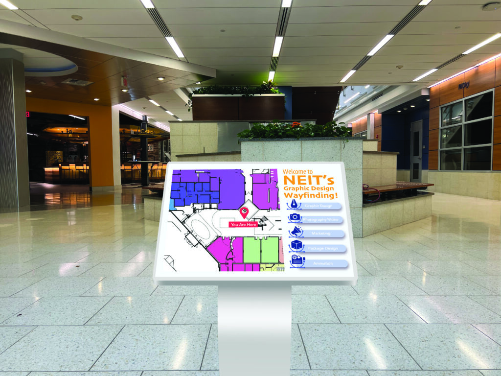
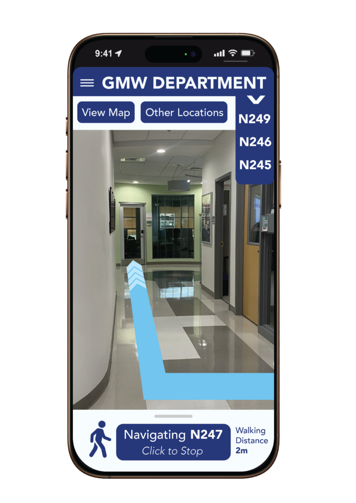
For our Waypoint Case Study project, we were tasked to create a digital kiosk mockup to fit in our school campus. The purpose of this assignment was to try and improve/provide a helpful tool that will make navigating around campus easier, especially for new students. It was up to us, the designers, to make a visually appealing layout that was also easy to understand and interact with. Additionally, this project challenged us to really research prior student projects to get some inspiration and see other takes on this assignment. For my own project, I wanted something visually appealing while still simple enough that it isn’t too hard to use.
The Client
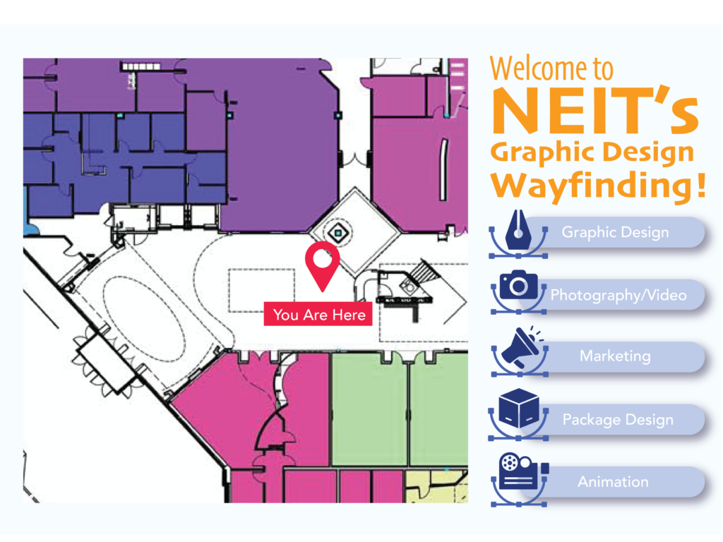
The client would be NEIT as a whole while focusing on the target audience of new students. The purpose of these mockups would be to enhance the wayfinding around campus by providing a quick and easy way to navigate specific classes. By providing pictograms of the different sections of the GMW suite, the client won’t have to second guess themselves when trying to find the class for the first time.
The Challenge
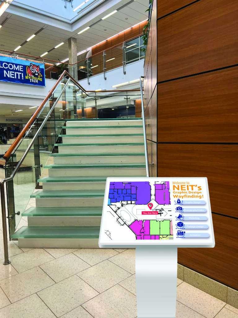
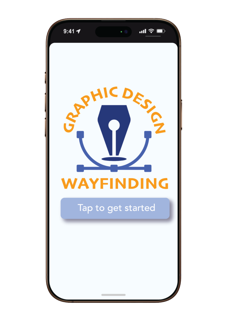
The main challenge that students face is being unable to navigate the GMW suite. The design labs are tucked away in their own specific section on campus. Although that can be helpful when navigating the suite as a whole, we have found that students often get confused or walk by the classrooms when trying to navigate them. To solve this problem, we have placed kiosk’s near main foot traffic points of the school, as well as a mobile app that students can download.
The Solution
Approaching The Challenge






Leave a Reply