Logo Process
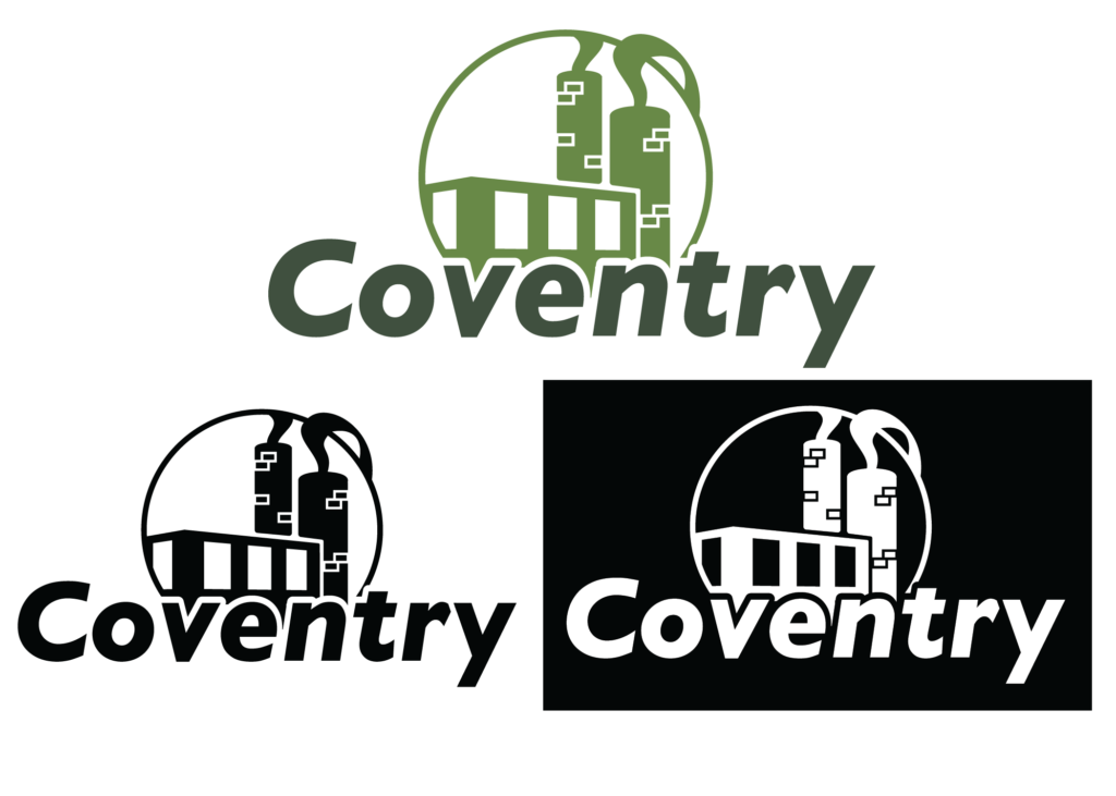
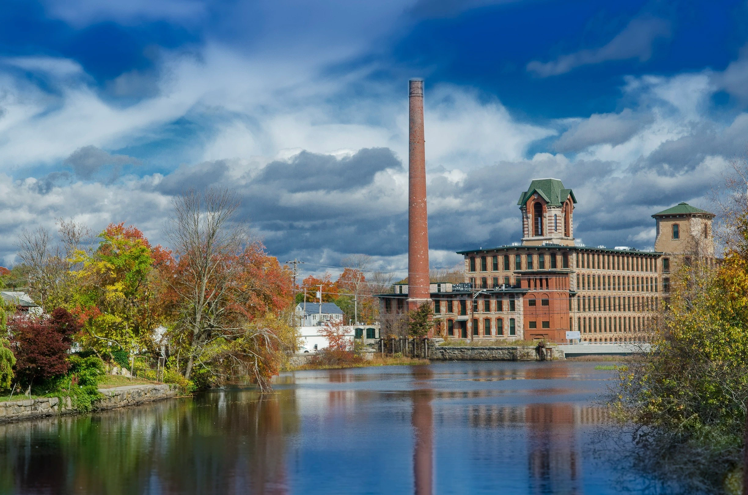
I grew up in the small town of Coventry, Rhode Island. With not much to work with, I had to dig into Coventry’s history, and found out that my town used to be an important mill town. I decided pretty quickly that I wanted to base my logo off of that fact, since it’s important to Coventry’s history. For my color choices, I went with green to symbolize the nature and old history of my hometown.
Outside Page Spread
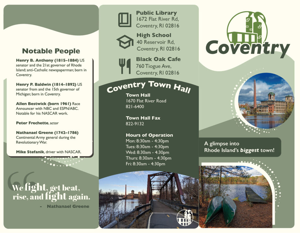
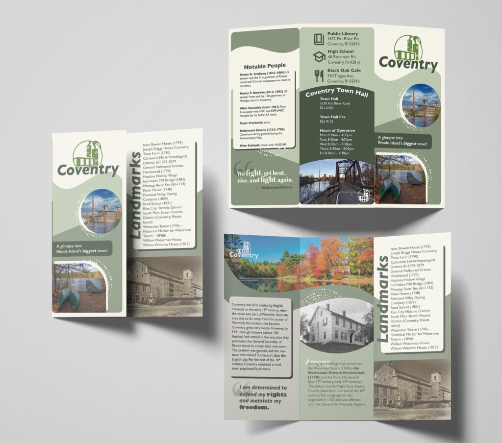
On the outside of the brochure is the cover page with the logo and complimentary pictures. The middle panel is of notable places in town, as well as the Coventry Town Hall information and hours of operation. Finally, on the left panel, are notable people from Coventry’s history that have helped shape the town.
Inside Page Spread
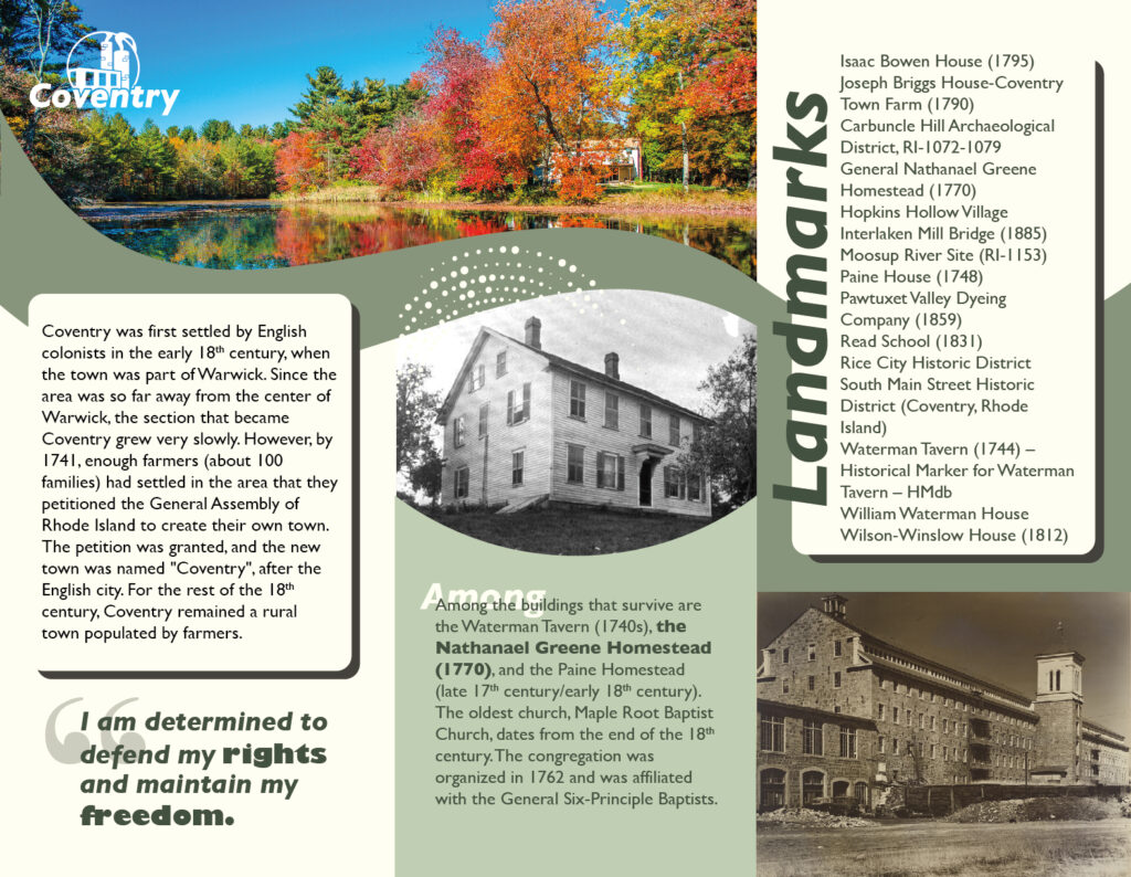
The inside layout consists of a brief explanation of Coventry’s history. Next to that is information about the Nathanael Greene Homestead, one of the most important landmarks in the city. On the right inside panel are important landmarks to compliment the notable people on the outside panel.
Final Mockup

Leave a Reply